Palette Map
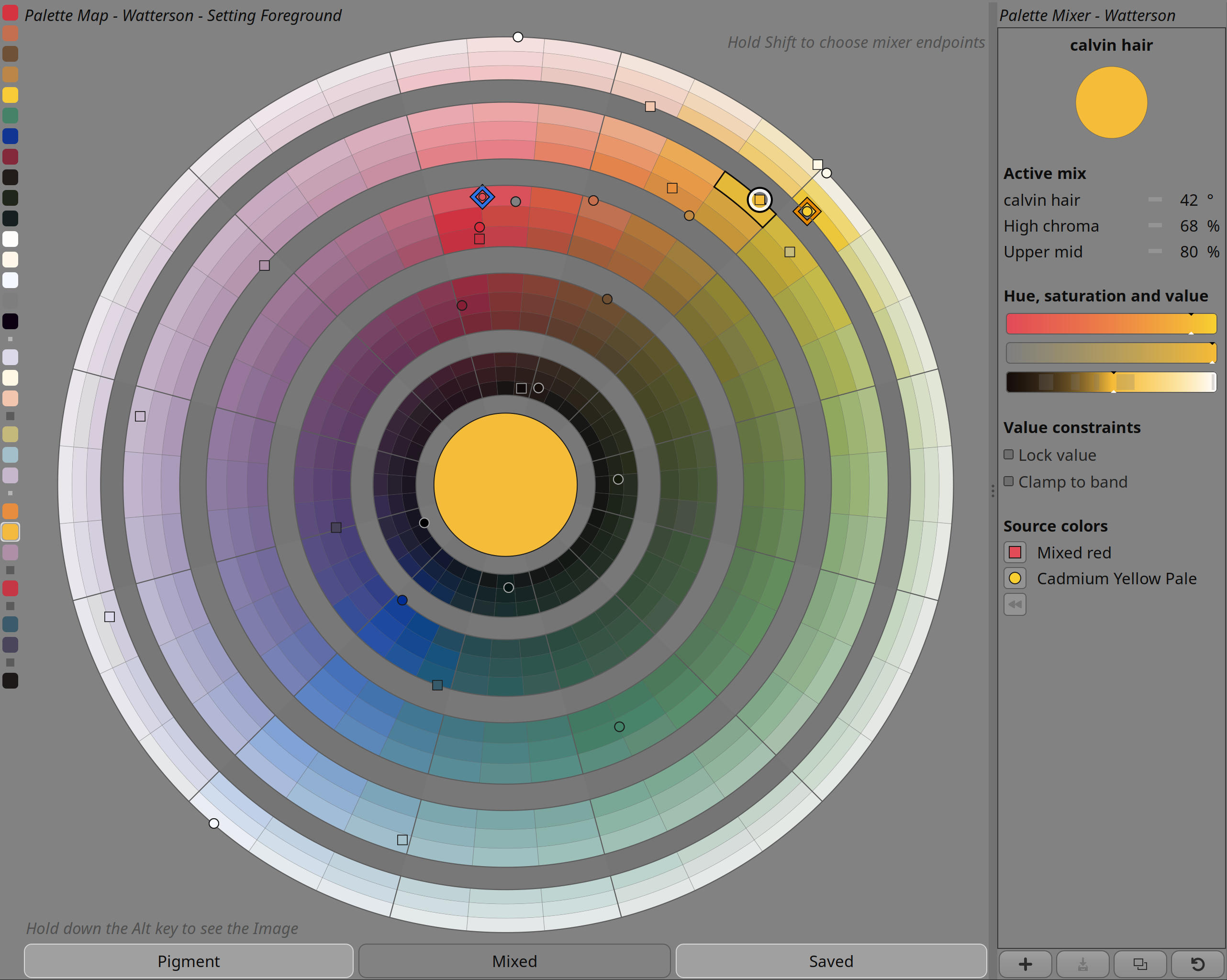
The Palette Map visualises what an active palette can produce. Starting from the palette’s pigments and saved colours, it presents the reachable colour space as a painter-friendly map of hue and value.
Its purpose is practical: instead of browsing a flat list of swatches, artists can see where colours live in relation to one another and move through the palette spatially.
A map of reachable colour
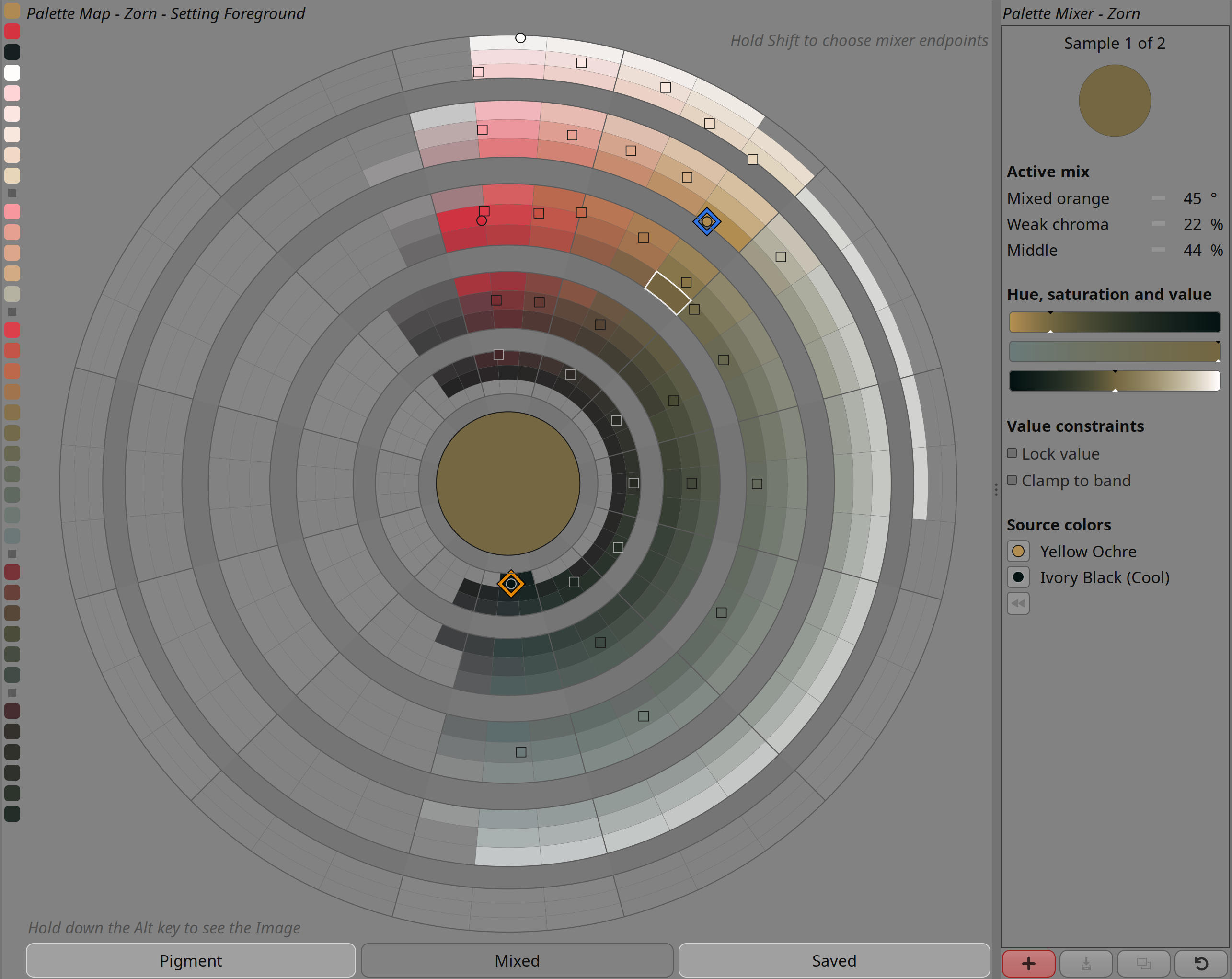
Every palette has a character. Some palettes open into clear greens and violets; others collapse quickly into warm neutrals, earth colours, or muted shadows. The Palette Map makes that character visible.
Generated mixes, primary pigments, and saved colours appear as part of one organised colour field. This makes it easier to understand not only which colours exist, but how they relate to the palette’s overall range.
Hue, value, and orientation
The map is arranged around hue and lightness so colour choices have a stable visual address. Bright colours, dark colours, warm shifts, cool shifts, saturated areas, and muted passages become easier to compare at a glance.
This spatial structure is especially useful when choosing the next colour in a painting. An artist can move toward a nearby hue, stay in the same value family, look for a stronger chroma, or deliberately step into a quieter neutral.
More than a picker
The Palette Map is also a bridge into mixing. Colours on the map can act as starting points for new mixtures, and saved mixes can keep their relationship to the map rather than becoming disconnected swatches.
This helps Lumi treat colour as a continuous working space. Picking, mixing, saving, and returning to colours all happen within the same palette geography.
Canvas-centred exploration
The map can be used as a large visual surface when colour decisions need more room. This makes it useful for comparing a potential colour against the painting itself, browsing tonal families, or quickly moving through the palette without relying on a small panel.
The intent is to make palette navigation feel immediate and visual: look at the colour world, move through it, and choose the mark that belongs next.
Palette identity
Because the Palette Map is generated from the active palette, switching palettes changes the map’s shape and emphasis. A limited portrait palette, a full-spectrum studio palette, and a muted landscape palette each produce a different colour geography.
In this way, the Palette Map becomes a portrait of the palette itself: a readable picture of what that colour system can do.